
emocha is Now Scene: How Our New Brand Reflects Our Commitment to Patients and Our Focus on Health Equity

Notice anything different? We relaunched today as Scene Health!
This massive change — more than a year in the making — will help us better support patients by reflecting our commitment to seeing each individual at the scene of their health.
It’s not just a makeover. Our new name, look and feel centers around our long-standing focus on advancing health equity through daily video check-ins and person-to-person connections.
Here, we’re sharing the specifics. Read on to learn what we’ve changed and why.
Setting the Scene (pun very much intended)
From our start as a technology developed by Johns Hopkins researchers to help public health workers in rural Uganda combat HIV, we’ve grown to become the leading medication engagement company. Our approach scales and enhances the gold standard of medication adherence, Directly Observed Therapy, to solve the $500B medication nonadherence problem.
Through this work, we’ve always focused on marginalized communities. Because we concentrate on person-to-person connections, we’ve been immensely successful in connecting with people to understand their challenges, and working with them to enable better health.
We do this by meeting each person at the scene of their health, anywhere and anytime, at every dose of their medication.
Why now?
As we approached our next chapter of growth, it became crucial for our brand to reflect who we are.
So, we got to work.
We partnered with the world's largest independent design consultancy, Pentagram, to conduct numerous interviews with patients, providers, clients, and clinical advisers that resulted in an ‘aha!’ moment, a realization that a name change was needed.
Our task was to land on a name and brand that better reflected our what and our why.
What’s changed?
Name
We see each person at the scene of their health — whether that’s in their home, on their way to work, or in the hospital — and we see what they’re dealing with. Through daily check-ins with each patient, our care team of pharmacists, nurses, and health coaches understand the social determinants of health (SDOH) at play and connect patients to resources to help address them.
Our unique ability to scale person-to-person connections helps extend the scene of health beyond doctor’s visits and enables better outcomes for everyone.
In the end, Scene was the perfect fit.
Logo
Our new logo draws from the conventional meaning of the word scene. In plays and screenwriting, action is always set between brackets, before the dialogue begins, and our new logo references that. The typeface used feels warm, friendly, and approachable, but can also feel somewhat serious. We liked that balance between sharp and soft, playful and serious.
We’re having fun with the brackets, too. You’ll see the brackets frame new product names, images, and icons. You’ll see them throughout our new website and brand to emphasize certain words in a fun way.
Along with the logo is a system of illustrations and photography that brings a spirit of humanity, empathy, and diversity in the scenography of the brand. Shots of color appear against the black logo and new key phrases in a deliberate color scheme. We’ve also included a set of stickers to bring some fun and informality to the brand.


Colors
When we spoke to patients and providers they told us stories about how warm and supportive their experience in the program felt and how fun back and forth videos with coaches and nurses were. Shouldn’t the colors in the app feel that way too?
Our new colors are a direct response to that. Our two primary colors - yellow and black - are strong and bold, but other accent colors keep the palette upbeat and optimistic. We hope they mirror the vibrancy and warmth that patients feel. You’ll see these bright colors showcased in fuller forms in illustrations throughout our materials.

Illustrations
With this rebrand, we knew we wanted to engage a super-talented illustrator to create a set of illustrations that could depict our vivacity and the enthusiasm we have for empowering people to better their health through breakthrough medication support. We’re helping people break through any medication challenges, and we wanted illustrations that packed a punch while being playful and energetic.
We were inspired by murals portraying scenes of vitality. We fell in love with Abbey Lossing’s illustration style; and worked with her to visualize the village that it takes to achieve better health outcomes. The community effort includes patients, care teams, and families coming together which is demonstrated in this vibrant scene.

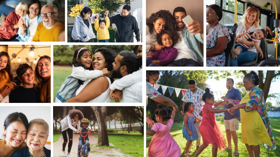
Photography
We wanted our brand to communicate the warm, motivational relationship we foster when engaging patients. With this in mind, we’ve chosen bright images that show a diverse array of real people in a host of different settings to convey that we meet everyone where they are. Our patient population is beautifully diverse across demographics, and our new photography highlights this vibrancy.
Voice and tone
Building off of our new look and feel, we also wanted to shift how we talk to more closely mirror how our care team of pharmacists, nurses, and health coaches speak to our patients. They’re motivational, supportive, energized, and conversational, which goes a long way. Our care team members become confidants, friends, and dedicated partners in helping patients feel empowered to improve their health — we love that and want our messaging to align. So you’ll see that we’re a bit more casual, more like a real person would talk, and a bit more energized while still being serious when we need to be.
The new Scene
Overall, this rebrand isn’t about changing who we are.
It’s about ensuring our brand accurately portrays who we are and what we do.
It’s about better reflecting our focus on patients and improving health equity.
It’s about renewing our commitment to see each individual at the scene of their health.
If you’ve been with us from the start, we hope you find this rebrand refreshing, and stay tuned to see our next moves!


